Overview
Noobill is a completely free bill handling system, with AI technology that actively checks and compares your bills to make sure you are never overcharged and always subscribed to the best deals. With pay-it-later and smart repayment tools, users can enjoy building great financial habits and avoid late fees, debt traps and bill stress.
Noobill tasked us with designing a new feature for their app; to provide users with a simple way to manage bills/rent splitting between housemates.
The Problem
A housemate wants to relieve their stress of managing financial responsibilities in a share house but has no platform to do so.
Through discovery research, Noobill identified that younger users (18-26) who have just moved out of home and start to pay their own bills are the best adopters of the app. Amongst them, it was reported the majority live in sharehouses. It was assumed that when it comes to utility bills and rent share, it can be a headache, and something that can break the friendship if not managed properly.
Our first goal was to identify the specific needs and pain points of flat-sharers, and how they are managing split payments now. We needed to uncover why it was a ‘headache’ and what specifically needed changing in the management of household funds.
Research & Insights
We conducted surveys and interviews to gather insights on the habits and concerns of flat sharing individuals; and a competitor analysis to seek the pros and cons of how other money managing apps handle the problem and appeal to the demographic.
What became evident was that the biggest hurdle for interacting with money and banking apps was resistance to the subject. For the target users, money has become the dominant source of stress over both relationships and work.
Removing this resistance must become the major goal of a mobile payment app. The less a user has to think about the topic and the less time they spend using the app, the better. Users should feel informed, trust the app and move on. This was achieved in the language used, the transparency of information, and the visuals themselves.
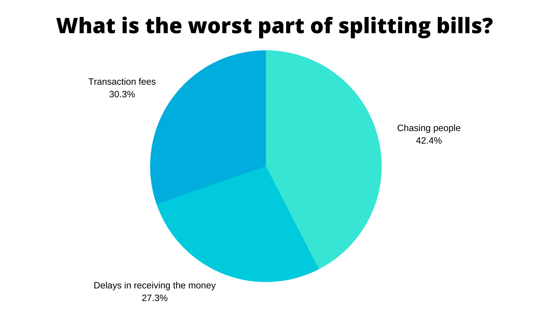

When it came to the specific issues of the tenants, it became quite clear that there was a common theme shared amongst all housemates:
With this in mind it was time to define our personas.
Personas
Creating personas encourages us to empathise with our users as we create solutions, reminding us of the identified frustrations and highlighted improvements uncovered with our research.
Claire is our main persona, she is a young professional that has been living out of home for 3 years. Living with others, she initially took on the responsibility of managing the house, and has inadvertently become the one who researches the deals, chases others up for payments and makes sure the bills are paid on time. Having a busy schedule and other pursuits, she wishes others would contribute to the household.

Philip is our secondary persona. Freshly out of home, he doesn’t feel as financially confident to make many of his own decisions and still relies on family for their opinions. He wants to become more financially independent and learn better habits, though for now, he is quite comfortable letting Claire make decisions and take the lead on the households bills.

How Might We?
After defining our personas, we curated the following ‘How Might We’ questions to give our brainstorming session a defined direction and determine helpful solutions.
How might we reduce the stress and burden of managing bills so that a housemate feels comfortable and in control (with minimal time/effort)?
How might we design a solution to make educating young people in better money management more gratifying?
How might we create a secure and trusted banking environment for our user?
Most Viable Product
Our ideas were logged into a matrix to reflect the most achievable solutions of greatest value. We came to the following ideas for development.

Click the image to view full-size
How We Shifted Gears
A meeting with the client was scheduled to discuss the research findings, our proposed solutions and the direction of the project.
Our client check-in meeting was incredibly valuable. It was communicated that what was truly desired was a simple split-bill user flow that would slot into the existing app.
It was identified that although our research, findings and personas were all on the money, we had let our ideations and solutions run away with us! We had a team meeting to realign our goals with the brief and nail a really well executed split-bill function without the bells and whistles.
Design, Develop, Test, Repeat!
With renewed determination we spent time creating user flows to specifically define the pages needed and steps taken through the split-bill system. As a team, we workshopped and tested these flows extensively to design the most pain-free journey, focusing on removing the resistance.


Refining
We sought to understand any shortfalls of the app overall by conducting user testing, setting specific tasks to gain insights into functionality of the design. We wanted to focus on:
- How efficient they are when using the app
- How easy it is for them to remember how to use it and how satisfied they are when they do
User testing revealed some flaws and below is how we tackled them, in turn improving our solution.
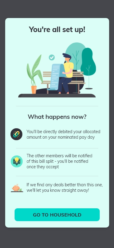
1) Actions needed confirmation: We added screens to confirm choices made by the user and explain their next steps, clarifying the process.


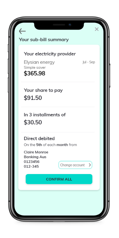
2) Hierarchy: On the sub-bill split page users needed to understand a lot of information at once, so we focused on the use of content hierarchy and typeface weight to indicate relative information.
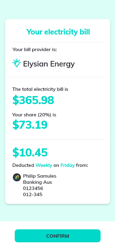

3) Succinct copy: Reducing the informative text to a ‘short and sweet’ style, making it easily digestible.

Final Design
Incorporating the user’s feedback, the updated design is a cleaner, streamlined experience that is more understandable.


On Reflection...
Our initial scope was far too broad. We got a bit adventurous with ideas and features instead of creating a specific request from the client. My team and I were incredibly grateful for the feedback and redirection.
Retrospectively as a team we failed to follow a direct line of thinking. Other ideas and thoughts slotted themselves in along the way, for eg, security and trust amongst our main goal. What I would do differently is make sure the discovery research is far more targeted.
We had some unique challenges and I feel that my strength within it was galvanising the team. I took the lead in making decisions when racing against the clock, as it was important to me that we delivered solutions as a group, rather than deliberate on the 5%.
Traverse
